Adding a color pop to your wedding
How to Add a Pop of Color Without Overwhelming Your Wedding Design
At some point in wedding planning, most couples hit the same moment:
You’ve chosen a neutral base, maybe black and white, and now you’re staring at colour options wondering… how much is too much?

Should you add one colour? Two?
What if it looks messy?
What if you regret it later?
When everything you see online looks bold, layered, and styled to perfection, it’s easy to feel unsure about your own choices.This uncertainty is incredibly common — and it doesn’t mean you lack taste or vision.
Most couples aren’t struggling with creativity. They’re struggling with how to use colour intentionally, rather than just adding it because it looks good in a photo.
The truth is: colour doesn’t need to shout to make an impact.
The goal isn’t to add more colour.
The goal is to use one colour well.
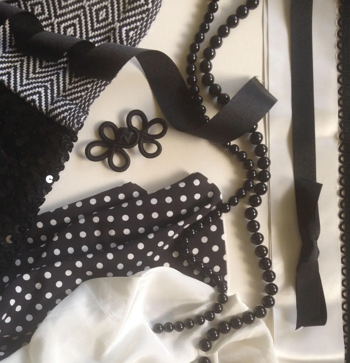
When you start with a simple black-and-white base, adding a single colour can instantly bring warmth, personality, and cohesion — without overwhelming the overall look.
Think of colour as an accent, not a theme.
A Simple Way to Think About Colour
Instead of asking “Which colours should I use?”, try asking:
“What feeling do I want this colour to create?”
Here’s how different colour families tend to behave when paired with black and white:
Red
Bold, romantic, and dramatic. Red brings intensity and confidence. It works beautifully for couples who want a sense of passion or statement moments.

Yellow
Bright and uplifting. Softer yellows feel warm and optimistic, while bolder shades feel playful and modern.

Green
Naturally calming and grounding. Deep greens feel rich and elegant; lighter greens feel fresh and organic.

Coral & Peach
Soft, romantic, and flattering. These tones soften a monochrome palette and add warmth without overpowering it.

Pink
From pale blush to bold fuchsia, pink can feel gentle, modern, or expressive depending on the shade.

Blue
Calm and timeless. Paler blues feel airy and classic, while teal or deeper blues add richness without heaviness.

Metallics (Gold, Copper, Silver)

Perfect for adding glow and contrast. Even small touches can elevate a black-and-white base.
When I was planning my own wedding, the colour choices were successful because it wasn't about variety — it was about consistency.
Once I chose a single accent colour and repeated it thoughtfully, everything felt intentional. The design stopped feeling busy and started feeling considered.
That shift — from adding more to choosing better — changed everything.
The Next Step
If you’re drawn to colour but unsure how to use it without overwhelming your wedding, the answer isn’t more inspiration — it’s clarity.
When you understand why you’re choosing a colour and how it supports the overall feel of your day, decisions become much easier. You stop second-guessing and start designing with intention.
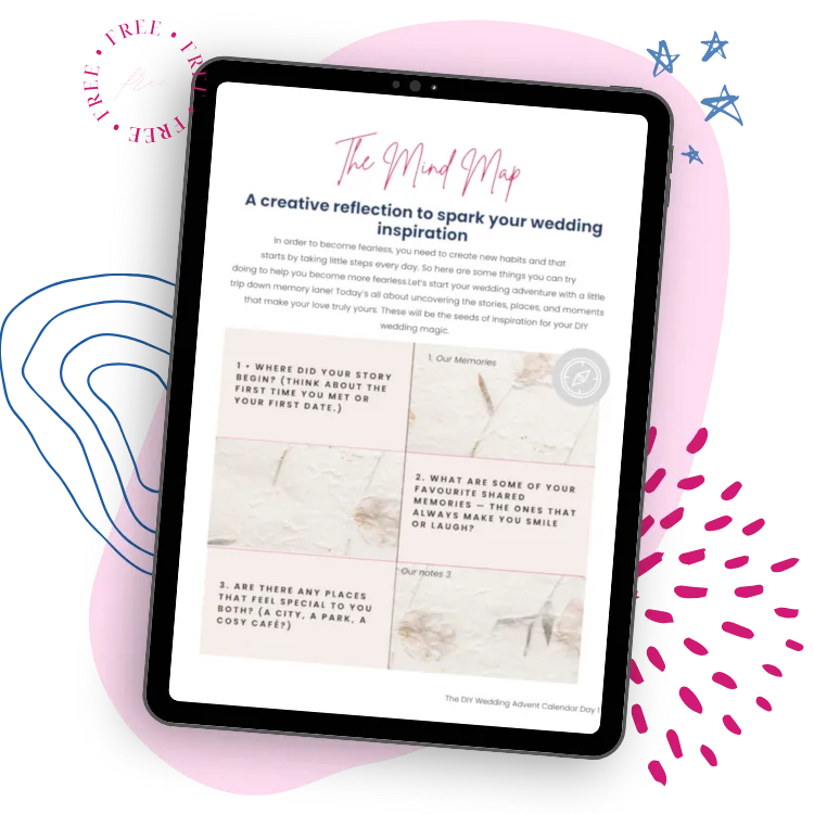
If you’d like help defining your overall wedding style and learning how to make confident design choices, I’ve created a free guide that walks you through the process step by step. It’s designed to help you move from scattered ideas to a clear, cohesive vision you can build from.
You can download it below and start shaping a wedding that feels like you — not a copy of someone else’s.